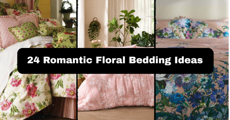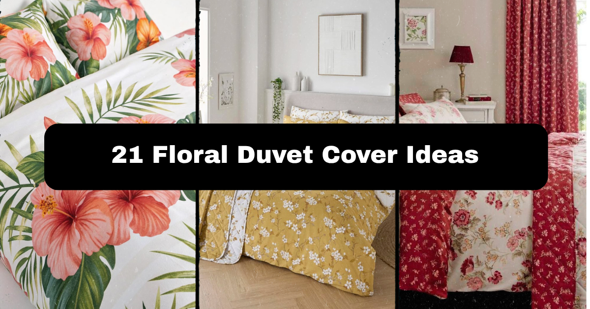
21 Floral Duvet Cover Ideas That Will Transform Your Bedroom
Choosing the right floral duvet cover isn’t just about picking a pretty pattern off a shelf. I’ve spent years studying bedroom design trends, testing fabrics, and talking to homeowners about what actually works in real life versus what just looks good in a catalog photo. That hands-on experience is exactly what shapes the advice you’ll find here.
So what are the best floral duvet cover ideas? The top picks include vintage rose gardens, ditsy prints, watercolor blooms, botanical noir, and oversized tropical patterns. Each style pairs with specific room colors, furniture woods, and seasonal moods for the best visual impact.
Stick around, because I’m about to walk you through 21 distinct floral duvet cover styles, plus fabric comparisons, styling mistakes to dodge, and tips that’ll make your bedroom look pulled from a design magazine.
Why Floral Duvet Covers Never Really Go Out of Style
Here’s the thing about florals — they’re kind of the little black dress of bedding. Trends come and go, but a well-chosen floral duvet cover always feels fresh. Maybe it’s because flowers connect us to nature, or maybe it’s just that soft, romantic vibe they bring to a room. Either way, florals work in a tiny studio apartment just as well as they do in a sprawling farmhouse bedroom.
The trick isn’t just picking any floral print. It’s matching the scale, color, and style of the flowers to your existing furniture, wall color, and the general mood you’re going for. A tropical print won’t feel right in a minimalist Scandinavian room, and a moody dark floral might clash in a bright, airy nursery. Let’s break down 21 ideas so you can find the one that actually fits your space.
1. Classic English Rose Garden

There’s something timeless about a classic English rose print. Full, layered blooms in deep pinks, reds, and greens instantly bring warmth into a bedroom. This style works best with wooden furniture — think oak or cherry finishes — paired with brass or gold hardware for an old-world charm. Keep your walls in soft cream or sage green so the duvet stays the star of the show.
A practical tip: add a solid-colored throw pillow in one of the rose tones to tie the whole bed together without overwhelming the space. This look suits traditional and cottagecore homes best, though it can soften a transitional space too. Next up, let’s look at a style that strips things way down.
2. Minimalist Single Bloom Print

If busy patterns aren’t your thing, a minimalist single bloom duvet is your answer. Think one large flower, maybe a poppy or a lily, printed on a clean white or ivory background. This works beautifully in modern bedrooms with sleek furniture, metal bed frames, and neutral rugs. Keep accessories sparse — one or two simple vases or a single piece of wall art is plenty.
The practical tip here is to let negative space do the work. Don’t clutter the nightstands with too many objects; the duvet needs breathing room to shine. This style suits modern, Japandi, and minimalist homes especially well. Now let’s turn up the volume with something a little wilder.
3. Tropical Botanical Explosion

For anyone craving a vacation-at-home vibe, a tropical floral duvet cover with palm leaves, hibiscus, and bold greens does the trick. Pair it with rattan furniture, wooden ceiling fans, and warm terracotta accents. Bright white walls help the colors pop without feeling chaotic.
A good practical tip is to keep your bedding trim (the sheets and pillowcases) in a solid neutral so the pattern doesn’t fight itself. This look is perfect for coastal, bohemian, or eclectic bedrooms. If tropical feels too loud, a softer wildflower option might be more your speed.
4. Vintage Wildflower Meadow

A wildflower meadow print, scattered with daisies, poppies, and cornflowers, gives off a relaxed, lived-in charm. This style pairs naturally with distressed wood furniture, wicker baskets, and vintage lace curtains. Stick to muted, earthy wall colors like dusty blue or warm beige.
Practical tip: layer a knit throw blanket at the foot of the bed for texture and to soften the busy print. This idea works wonderfully in farmhouse, rustic, and shabby-chic homes. Now, let’s soften things even further with a watercolor approach.
5. Watercolor Floral Wash

Watercolor florals have a dreamy, hand-painted quality that feels artistic without being overwhelming. Soft blurred edges in blush, lavender, and sage make this a versatile choice for almost any bedroom style. Pair it with light wood or white furniture and airy linen curtains.
A helpful tip: choose a watercolor print with a limited color palette (three shades max) to keep the room feeling calm rather than busy. This style shines in transitional, modern farmhouse, and even glam bedrooms. Next, let’s talk about a pattern that’s small but mighty.
6. Ditsy Floral Print

Ditsy florals are those tiny, repeated flower patterns you often see on vintage dresses. They’re subtle, sweet, and surprisingly easy to style. Pair a ditsy floral duvet cover with painted white furniture and simple gingham or striped accent pillows.
Practical tip: since the pattern is busy but small-scale, avoid pairing it with another busy print in the same room — let it stand alone as the pattern piece. This works great in cottage, vintage, and kids’ bedrooms. Ready for something bolder? Let’s go big.
7. Bold Oversized Blooms

Oversized floral prints make a serious statement. Think dinner-plate-sized peonies or hibiscus flowers splashed across the duvet. This style needs a bit of restraint elsewhere in the room — simple furniture, solid-colored walls, and minimal clutter.
My tip: pick just one other color from the print (like a leaf green or deep coral) and repeat it in a rug or curtain to create cohesion. This bold look fits modern, maximalist, and glam interiors particularly well. Now, let’s flip the color script entirely.
8. Black and White Floral Contrast

A black and white floral duvet cover brings graphic drama without committing to color. It pairs beautifully with black metal bed frames, white walls, and pops of a single accent color like mustard or blush in the pillows.
Practical tip: use this print in rooms with lots of natural light, since the contrast can feel a bit heavy in dim spaces. This style suits modern, industrial, and even Scandinavian bedrooms. Next, let’s ease into something a little gentler on the eyes.
9. Pastel Spring Blossom

Soft pastel florals in baby pink, lilac, and mint feel like a breath of fresh spring air. Pair this duvet with white or light wood furniture and sheer curtains to keep the whole room feeling light and airy.
Tip: avoid pairing pastel florals with heavy dark furniture, as it can feel visually off-balance. This style is a favorite for feminine, romantic, and shabby-chic bedrooms. If pastels feel too soft, let’s swing the other way.
10. Dark Moody Florals (Botanical Noir)

Dark floral prints on black or deep navy backgrounds create a rich, moody atmosphere. This look pairs perfectly with brass fixtures, velvet accent chairs, and warm ambient lighting like a dimmable lamp.
A useful tip: balance the darkness with at least one light-colored element, like a cream throw blanket, so the room doesn’t feel too heavy. This idea works beautifully in traditional, eclectic, and glam bedrooms. Next, let’s travel to Japan for some quiet elegance.
11. Japanese Cherry Blossom

A cherry blossom print, with its delicate pink petals against a neutral or black background, brings quiet elegance to any bedroom. Pair it with low-profile wood furniture, paper lanterns, or simple bamboo accents.
Tip: keep the rest of the room minimal so the cherry blossom pattern feels intentional rather than crowded. This style fits Japandi, zen, and minimalist bedrooms especially well. Now let’s head to the French countryside.
12. French Country Toile Floral

Toile patterns, with their intricate scenic florals often printed in a single color like blue or red on cream, bring old-world sophistication. Pair with antique wood furniture, wrought iron accents, and simple linen curtains.
Practical tip: choose a toile print with a color that matches one existing element in your room, like a lamp or rug, to keep things cohesive. This style is a natural fit for traditional and French country homes. Let’s move to something with more texture next.
13. Embroidered Floral Texture

Embroidered floral duvet covers add dimension you can actually feel, not just see. The raised stitching works well with simple, solid-colored furniture so the texture gets the attention it deserves.
Tip: pair embroidered florals with a smooth sateen sheet set underneath for a nice contrast in texture. This style suits traditional, boho, and romantic bedrooms. Now, let’s tone things down to a single color family.
14. Monochrome Floral Tone-on-Tone

A tone-on-tone floral, where the flowers are just a shade darker or lighter than the background, gives subtle texture without loud color. This works in nearly any room style since it reads almost like a solid from a distance.
Tip: use this as a “safe” choice if you’re testing out florals for the first time but aren’t ready to commit to bold color. This fits modern, transitional, and minimalist spaces. Next, let’s go bright and cheerful.
15. Sunflower Field Print

Sunflowers bring instant cheerfulness with their bright yellow petals and dark centers. Pair with warm wood furniture and mustard or olive accent pillows to echo the print’s natural tones.
Tip: this pattern works best in south-facing rooms that already get plenty of natural light, amplifying that sunny feeling. It suits farmhouse, rustic, and country-style bedrooms. Now let’s look at a more romantic bouquet-style option.
16. Peony and Ranunculus Bouquet

A bouquet-style print featuring full peonies and ranunculus blooms feels romantic and luxurious. Pair with upholstered headboards and soft velvet or chenille throw pillows in complementary blush or wine tones.
Tip: since this print is detailed, keep your bedding set (sheets, shams) simple and solid to avoid visual overload. This style fits glam, romantic, and traditional homes. Let’s shift to something more artistic and sketch-like.
17. Wildflower Line Drawing (Botanical Sketch)

This style uses simple black or single-color line drawings of wildflowers on a plain background, similar to a botanical field guide. It pairs well with black-and-white photography on the walls and simple metal or wood furniture.
Tip: this understated look is great if you want a floral pattern that still feels gender-neutral. Fits modern, minimalist, and Scandinavian bedrooms nicely. Now let’s head somewhere warmer and more tropical again, but different.
18. Tropical Hibiscus and Palm

Different from the earlier tropical explosion, this version focuses specifically on hibiscus flowers paired with palm fronds in a slightly more muted, sophisticated palette like terracotta and forest green. Pair with woven textures and warm lighting.
Tip: use woven rattan lampshades to echo the natural, tropical feel without adding more pattern. Works well in coastal, bohemian, and eclectic bedrooms. Next, let’s slow things down with a calming field of purple.
19. Lavender Field Print

A lavender field print, with rows of purple blooms, brings a calming, almost aromatherapy-like feeling to a bedroom. Pair with soft gray or white furniture and linen bedding underneath for a relaxed cottage feel.
Tip: this print pairs beautifully with a lavender-scented candle or diffuser to complete the sensory experience. Great for cottage, French country, and relaxed farmhouse bedrooms. Let’s look at a more structured floral pattern next.
20. Floral Trellis or Vine Pattern

This design features flowers climbing along a trellis or vine structure, giving a more structured, garden-like feel. Pair with iron bed frames or furniture with curved, garden-inspired details.
Tip: this pattern works particularly well in bedrooms that already have some greenery, like potted plants, since it echoes that living garden feel. Fits traditional, cottage, and garden-style homes. Finally, let’s end with a pattern mashup.
21. Mixed Floral and Stripe Combo

Combining florals with stripes, either through a reversible duvet or a bold border design, gives a playful, collected look. Pair with simple furniture and let the duvet do all the talking.
Tip: if your duvet is reversible, you basically get two looks for the price of one — flip it based on your mood or the season. This style fits eclectic, coastal, and preppy bedrooms best. Now that we’ve covered all 21 ideas, let’s talk fabric and care.
Comparing Fabric Types for Floral Duvet Covers
Picking the right pattern is half the battle. The fabric it’s printed on matters just as much for comfort, durability, and how those colors actually look over time.
Fabric Comparison Table
| Fabric Type | Feel | Best Season | Durability | Care Level |
|---|---|---|---|---|
| Cotton Percale | Crisp, cool | Summer | High | Easy, machine wash |
| Cotton Sateen | Soft, silky sheen | Year-round | Medium-High | Moderate, gentle wash |
| Linen | Textured, breathable | Summer | High | Moderate, may wrinkle |
| Flannel | Warm, cozy | Winter | Medium | Easy, machine wash |
| Microfiber | Smooth, lightweight | Year-round | Medium | Very easy |
| Velvet (accent only) | Plush, heavy | Fall/Winter | Medium | Dry clean often needed |
Floral Style by Room Type Table
| Floral Style | Best Room Style | Best Season | Color Intensity |
|---|---|---|---|
| English Rose Garden | Traditional | Fall/Winter | High |
| Minimalist Bloom | Modern | Year-round | Low |
| Tropical Explosion | Coastal/Boho | Summer | High |
| Watercolor Wash | Transitional | Spring | Medium |
| Botanical Noir | Glam/Eclectic | Fall/Winter | High |
| Ditsy Print | Cottage/Kids | Spring | Low-Medium |
Tips for Success
Getting a floral duvet cover to actually look good in your room takes a bit more thought than just liking the print in a photo. Here’s what I always tell people:
- Match the scale of the floral print to the size of your room — big blooms in a small room can feel cramped.
- Choose one dominant color from the print and repeat it somewhere else, like a rug or curtain.
- Stick to solid or simple textures for sheets and pillowcases underneath a busy duvet.
- Consider the season — lighter florals for spring and summer, darker moody florals for fall and winter.
- Wash new duvet covers before first use to soften the fabric and check for shrinkage.
Common Mistakes and How to Avoid Them
Even a gorgeous floral duvet cover can fall flat if a few small details get overlooked.
Mistake: Pairing busy florals with busy curtains or rugs.
Fix: Keep other textiles solid or subtly textured.
Mistake: Ignoring furniture wood tone.
Fix: Match warm florals with warm wood, cool florals with lighter or painted furniture.
Mistake: Choosing a print based only on an online photo.
Fix: Order a fabric swatch when possible, since colors shift under different lighting.
Mistake: Overloading the bed with too many patterned pillows.
Fix: Limit to two or three accent pillows max.
Similar Variations You Can Try
If none of these 21 quite hit the mark, there are a few close variations worth considering:
- Floral and botanical leaf mashups instead of pure flowers
- Ombre florals that fade from bold color to white
- Metallic-accented florals for a touch of glam
- Reversible duvets pairing floral on one side and solid on the other
- Seasonal duvet swaps, keeping a lighter floral for summer and a deeper one for winter
Wrapping It Up
Picking the right floral duvet cover really comes down to knowing your room’s style, your favorite colors, and how bold you want to go. Whether you lean toward a soft watercolor wash or a dramatic botanical noir, there’s a floral option here that’ll fit your space and your personality. I hope these 21 ideas gave you a clearer picture of what’s possible, and that you walk away ready to pick a floral duvet cover that finally feels like you.