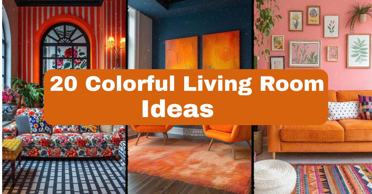
20 Colorful Living Room Ideas That’ll Transform Your Space
As I have spent numerous years in studying colorful interior designs trends, experimenting with the colors and understanding what works in practice in contrast to beautiful pictures on Pinterest. I have gathered all my experience in one guide for you to have practical information.
But what are the best colorful living room ideas then? The most popular methods are accent walls with jewel tones, complimentary colors, bold rug background and textile layers. Every technique is aimed at creating an impressive effect that would not make your room unliveable.
Stay tuned, since I am going to share 20 different ways to decorate your living room, with color schemes and furnitures’ recommendations.
Why Color Matters More Than You Think
Here’s the thing about living rooms. They’re the heart of the house. People gather there, kids play there, you binge Netflix there. So why do so many living rooms look… beige?
I get it. Color feels risky. What if you hate it in six months? What if it clashes with your furniture? These are valid worries. But a colorless room isn’t “safe”, it’s just forgettable. The ideas below solve that problem while keeping practicality front and center.
1. Jewel-Tone Accent Wall

Any color from deep emerald to sapphire blue or ruby red on just one wall is sure to transform a room’s atmosphere. It is because such an option implies using bold hues without requiring any redecoration of all surfaces. One should choose that wall, which has always been a focal point in a room—a wall behind the sofa or fireplace will do just fine.
The use of metallics like brass or gold will create luxurious interior. One has to keep the sofa in neutral colors, like camel or cream ones. Such decor works best for traditional and art deco homes but can look perfect in modern interiors as well.
Practical suggestion: test samples of paint colors at various hours of the day before making a final decision—such shades tend to change greatly when artificial lights are turned on.
And it flows naturally into the next idea, which is even bolder in its use of colors.
2. Rainbow Gallery Wall

Instead of one colorful wall, why not build a gallery using colorful art, prints, and photos? This scattered rainbow effect feels playful without being chaotic, as long as you keep frames consistent (all black, all white, or all wood).
Choose a mix of abstract art, botanical prints, and personal photos with colorful mats. Arrange pieces salon-style, filling the wall edge to edge. This works beautifully in eclectic or bohemian living rooms, and even minimalist spaces can handle it if the color palette stays cohesive.
Practical tip: Lay your pieces on the floor first to map the layout before hammering a single nail.
Next, let’s talk about using furniture itself as your color statement, not just the walls.
3. Color-Blocked Furniture Arrangement

Skip the neutral sofa. A mustard yellow couch, teal armchair, and coral throw pillows create a color-blocked look that feels intentional and fresh. This works because each piece holds its own visual weight instead of blending into the background.
Balance bold furniture with neutral flooring and walls so the room doesn’t feel like a crayon box exploded. Add black metal accents (lamps, side tables) to ground the palette. This style fits mid-century modern and contemporary homes particularly well.
Practical tip: Choose one dominant color and two supporting colors—never split evenly, or the room loses hierarchy.
Now that furniture’s covered, let’s explore how an entire theme, like tropical vibes, can guide your color choices.
4. Tropical Paradise Theme

Think palm greens, hot pink, and turquoise. This theme brings vacation energy home, using nature-inspired colors that feel vibrant but not overwhelming. Layer in rattan furniture and leafy plants to complete the look.
Choose a botanical print sofa or curtains as your anchor piece, then pull matching solid colors for pillows and rugs. This works incredibly well in sunrooms or homes with lots of natural light. Coastal and boho homes adapt naturally to this palette.
Practical tip: Real plants (not fake ones) amplify the tropical feel and improve air quality too.
From tropical brightness, let’s shift toward something a bit more atmospheric: sunset-inspired palettes.
5. Sunset-Inspired Palette

Burnt orange, dusty pink, and deep purple mimic a sunset’s glow. This combination feels warm and cozy rather than jarring, making it perfect for rooms where you want relaxation, not stimulation.
Use these colors in layers: a burnt orange accent chair, blush throw blankets, and deep purple curtains. Metallic copper accents tie everything together beautifully. This palette suits both bohemian and transitional design styles.
Practical tip: Dimmable warm-toned lighting enhances this palette after dark, making colors glow rather than flatten.
Speaking of layering colors, let’s dive into how an eclectic bohemian mix takes this even further.
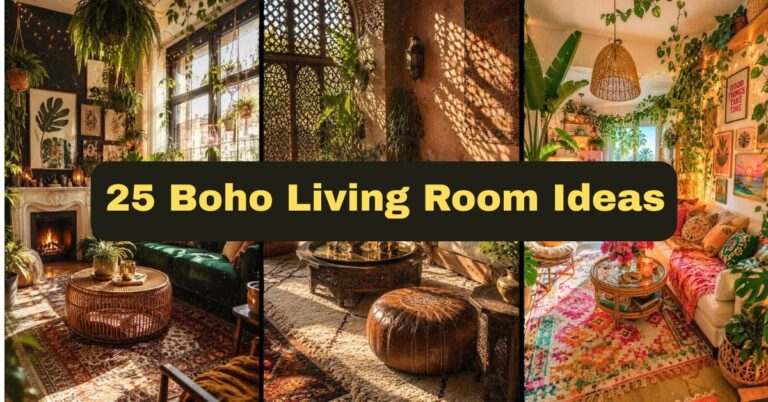
6. Eclectic Bohemian Mix

Boho style thrives on “controlled chaos.” Mix patterns, textures, and colors from different cultures and eras. Moroccan rugs, macramé wall hangings, and mismatched throw pillows all coexist happily here.
Anchor the room with one large patterned rug, then build outward with complementary (not matching) colors. Vintage furniture pieces add character. This approach fits naturally in bohemian and eclectic homes, though a toned-down version works in transitional spaces too.
Practical tip: Stick to a three-color family (like terracotta, mustard, and forest green) even within the chaos—it keeps things from feeling messy.
Next, let’s simplify things with a monochromatic approach that still packs a colorful punch.
7. Monochromatic Color Pop

Choose one bold color—say, teal—and use it in varying shades throughout the room. Light teal walls, medium teal cushions, dark teal curtains. This creates depth without introducing competing hues.
Add texture through fabric choices (velvet, linen, boucle) since color variation is limited. Neutral wood tones in furniture keep things grounded. This works wonderfully in modern and Scandinavian-inspired homes craving simplicity with personality.
Practical tip: Use a color wheel app to find 3-4 shades of your chosen color before shopping.
Now let’s explore what happens when you pair two colors directly across from each other on that same color wheel.
8. Complementary Color Duo

Orange and blue. Purple and yellow. Red and green. Complementary colors create striking contrast because they’re opposites. This approach makes a room feel energetic and visually balanced simultaneously.
Pick one color as dominant (70% of the room) and the other as an accent (30%). A navy sofa with mustard pillows, for example, feels sophisticated rather than clashing. This pairing suits contemporary and mid-century modern homes especially well.
Practical tip: Keep one color matte and the other slightly glossy (like a lacquered side table) to add visual interest.
From bold contrasts, let’s soften things up with a pastel dreamscape approach.
9. Pastel Dreamscape

Soft pink, baby blue, and lavender create a gentle, calming atmosphere. Pastels feel colorful without the intensity of jewel tones, making them approachable for color-shy decorators.
Combine pastel furniture with white or cream walls to prevent the room from feeling too saccharine. Add one deeper accent color (like navy) to ground the palette. This style fits cottagecore, farmhouse, and shabby-chic homes beautifully.
Practical tip: Mix in natural wood tones to keep pastels from feeling overly sweet or nursery-like.
Ready for more visual complexity? Let’s talk pattern play next.
10. Maximalist Pattern Play

Florals, stripes, geometrics—all in one room? Yes, really. Maximalism thrives on layering multiple patterns and colors intentionally. This works because it rejects minimalism entirely, creating a rich, collected-over-time feel.
Start with a large-scale pattern (like a floral sofa), then add smaller-scale patterns (striped pillows, geometric rug) in coordinating colors. This approach suits eclectic, Victorian, and grandmillennial-style homes especially well.
Practical tip: Vary pattern scale—large, medium, small—so nothing competes for the same visual space.
Textiles play a huge role in maximalism, so let’s dig deeper into layering fabric specifically.
11. Colorful Textile Layering

Throw blankets, pillows, curtains, and rugs offer low-commitment ways to introduce color. This approach is perfect for renters or anyone hesitant to paint walls a bold shade.
Choose a base neutral sofa, then layer 3-4 colorful textiles in varying textures (velvet pillow, knit throw, woven rug). Rotate seasonally for a fresh look without major investment. This works in literally any home style since textiles are easy to swap.
Practical tip: Wash and store off-season textiles properly to keep colors vibrant longer.
Speaking of low-commitment color, furniture pieces like a statement chair offer another easy entry point.
12. Accent Chair Statement

One boldly colored chair—say, a mustard velvet armchair—can transform an otherwise neutral room. This single-piece approach lets you experiment with color without redesigning everything.
Place the chair where it catches the eye immediately upon entering the room. Keep surrounding furniture neutral so the chair truly pops. This works in nearly every home style, from modern farmhouse to traditional.
Practical tip: Choose a chair color that complements your existing artwork or rug for cohesion.
If you’re already thinking about flow between rooms, let’s discuss how color can connect adjacent spaces.
13. Vibrant Kitchen-Adjacent Flow

Open-concept homes need color continuity between kitchen and living room. This approach uses a shared color thread (like sage green cabinets echoed in living room pillows) to unify the space visually.
Pick one or two colors present in your kitchen and repeat them subtly in your living room decor. This creates flow without forcing identical color schemes. Works especially well in modern and farmhouse open-concept homes.
Practical tip: Walk through both spaces together when choosing paint swatches—colors read differently in isolation versus in context.
Now, let’s look backward in time with an art-deco color revival approach.
14. Art-Deco Color Revival

Rich jewel tones, gold accents, and geometric patterns define art-deco style. This approach feels glamorous and intentional, evoking 1920s luxury within a modern living room.
Combine deep emerald or navy furniture with brass lighting fixtures and geometric-patterned rugs. Mirrored or lacquered surfaces amplify the glam factor. This style fits naturally in traditional and transitional homes seeking sophistication.
Practical tip: Limit art-deco patterns to one or two pieces (rug and pillows) to avoid visual overload.
From glamour, let’s ground ourselves back in nature with earth tones featuring colorful accents.
15. Nature-Inspired Earth Tones with Pops

Terracotta, moss green, and warm browns form a grounded base, while pops of coral or gold add vibrancy. This approach feels organic and calming while still being visually interesting.
Use natural materials—jute rugs, wood furniture, linen curtains—as your foundation. Add colorful accent pieces (vases, throw pillows) sparingly. This style suits Scandinavian, Japandi, and modern farmhouse homes particularly well.
Practical tip: Incorporate real or dried botanicals to reinforce the nature-inspired palette naturally.
Let’s take a nostalgic turn now toward retro color schemes.
16. Retro 70s Color Scheme

Burnt orange, avocado green, and mustard yellow scream retro charm. This nostalgic approach feels warm, playful, and distinctly different from today’s minimalist trends.
Combine these colors with curved furniture silhouettes and shag rugs for authenticity. Vintage or vintage-inspired lighting fixtures complete the look. This works beautifully in retro-themed or eclectic homes wanting a conversation-starting living room.
Practical tip: Thrift stores are goldmines for authentic retro pieces at a fraction of new-furniture cost.
Moving from floor-level nostalgia, let’s look up—literally—at ceiling treatments.
17. Colorful Ceiling Treatment

The “fifth wall” often gets ignored. Painting your ceiling a bold color (deep blue, forest green) creates a dramatic, cocoon-like effect that surprises guests immediately upon entering.
Keep walls lighter or neutral so the ceiling doesn’t feel oppressive. This approach works particularly well in rooms with high ceilings, preventing the space from feeling too vast or impersonal. Modern and traditional homes both handle this trend well.
Practical tip: Use a slightly glossy finish on ceiling paint to reflect light and prevent a “cave-like” feeling.
Ceilings covered, let’s discuss another underused surface: two-tone walls.
18. Two-Tone Wall Design

Painting the bottom half of your wall one color and the top half another (with a chair rail or painted line dividing them) adds visual interest without committing to a single bold shade everywhere.
Choose complementary colors, like navy on bottom and cream on top, for classic appeal. This technique works exceptionally well in traditional and transitional homes, adding architectural interest even in older houses lacking built-in molding.
Practical tip: Use painter’s tape and a level to ensure your dividing line stays perfectly straight.
From walls, let’s move to the floor with a colorful rug as your starting point.
19. Colorful Rug as Foundation

Instead of choosing colors first and finding a matching rug later, flip the process. Start with a bold, colorful rug and build your entire palette around it. This approach guarantees cohesion since everything else supports one central piece.
Pull 2-3 colors directly from the rug’s pattern for pillows, art, and accents. Keep larger furniture pieces (sofa, chairs) neutral to let the rug shine. This works in virtually any home style, from bohemian to modern.
Practical tip: Order rug samples before buying full-size—colors often look different in person versus online photos.
Finally, let’s discuss an idea that keeps your colorful living room feeling fresh all year long.
20. Seasonal Color Rotation Strategy

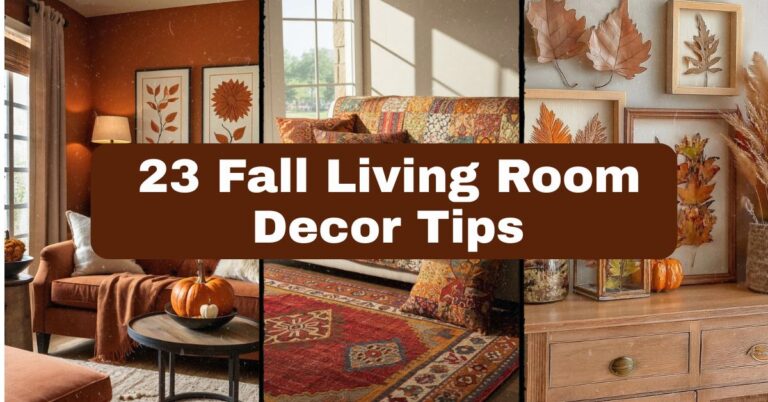
Rather than committing to one permanent palette, rotate accent colors seasonally. Cool blues and greens in summer, warm oranges and reds in fall—this keeps your space feeling alive and current without major renovations.
Invest in a neutral base (sofa, walls, large furniture) and swap smaller accents (pillows, throws, art) each season. This budget-friendly approach suits literally any home style since it’s about flexibility, not permanence.
Practical tip: Store off-season decor in labeled bins to make rotation quick and painless.
Color Palette Comparison Table
| Palette Style | Primary Colors | Best Home Style | Mood Created |
|---|---|---|---|
| Jewel Tones | Emerald, Sapphire, Ruby | Traditional, Art-Deco | Luxurious, Bold |
| Pastel Dreamscape | Pink, Blue, Lavender | Cottagecore, Farmhouse | Calm, Soft |
| Complementary Duo | Orange/Blue, Purple/Yellow | Modern, Mid-Century | Energetic, Balanced |
| Earth Tones + Pops | Terracotta, Moss, Coral | Scandinavian, Japandi | Grounded, Organic |
| Retro 70s | Mustard, Avocado, Orange | Eclectic, Retro | Nostalgic, Warm |
| Tropical | Green, Pink, Turquoise | Coastal, Boho | Vibrant, Fresh |
Tips for Success
Getting color right takes more than picking pretty swatches. Here’s what actually matters:
- Test paint colors in your actual room, under your actual lighting, before committing
- Start small with pillows or art if you’re nervous about bold color commitments
- Use the 60-30-10 rule: 60% dominant color, 30% secondary, 10% accent
- Consider natural light direction—north-facing rooms handle warm colors better
- Photograph your room and edit colors digitally to preview changes before buying
Common Mistakes and How to Avoid Them
Definition List: Color Mistakes
Overcrowding Colors
: Using too many unrelated colors creates visual chaos. Stick to a cohesive palette of 3-5 colors max.
Ignoring Undertones
: Every color has warm or cool undertones. Mixing warm reds with cool blues without a bridging neutral creates clashing energy.
Skipping the Neutral Anchor
: Even bold rooms need neutral elements (white trim, wood floors) to balance intensity and prevent visual fatigue.
Poor Lighting Consideration
: Colors shift dramatically between daylight and artificial light. Always test swatches at different times of day.
Rushing the Process
: Slapping color everywhere at once often backfires. Layer gradually, living with each addition before adding more.
Similar Variations Worth Exploring
If these 20 ideas sparked your creativity, consider these related variations:
- Ombre wall treatments – blending one color from light to dark across a single wall
- Color-drenched rooms – painting walls, trim, and ceiling all the same bold color
- Terrazzo-inspired accents – incorporating colorful terrazzo patterns in small decor pieces
- Biophilic color schemes – using colors found specifically in local native plants
- Color-coded shelving – organizing books and decor by color for a rainbow bookshelf effect
Wrapping Up
I hope these colorful living room ideas gave you the confidence to finally ditch that all-beige plan. Color isn’t scary once you understand how to balance it—dominant hues, supporting shades, and neutral anchors working together.
Whether you go bold with jewel tones or ease in with textile layering, the goal stays the same: create a living room that feels like you. Start small, test what excites you, and don’t be afraid to make your living room genuinely colorful.