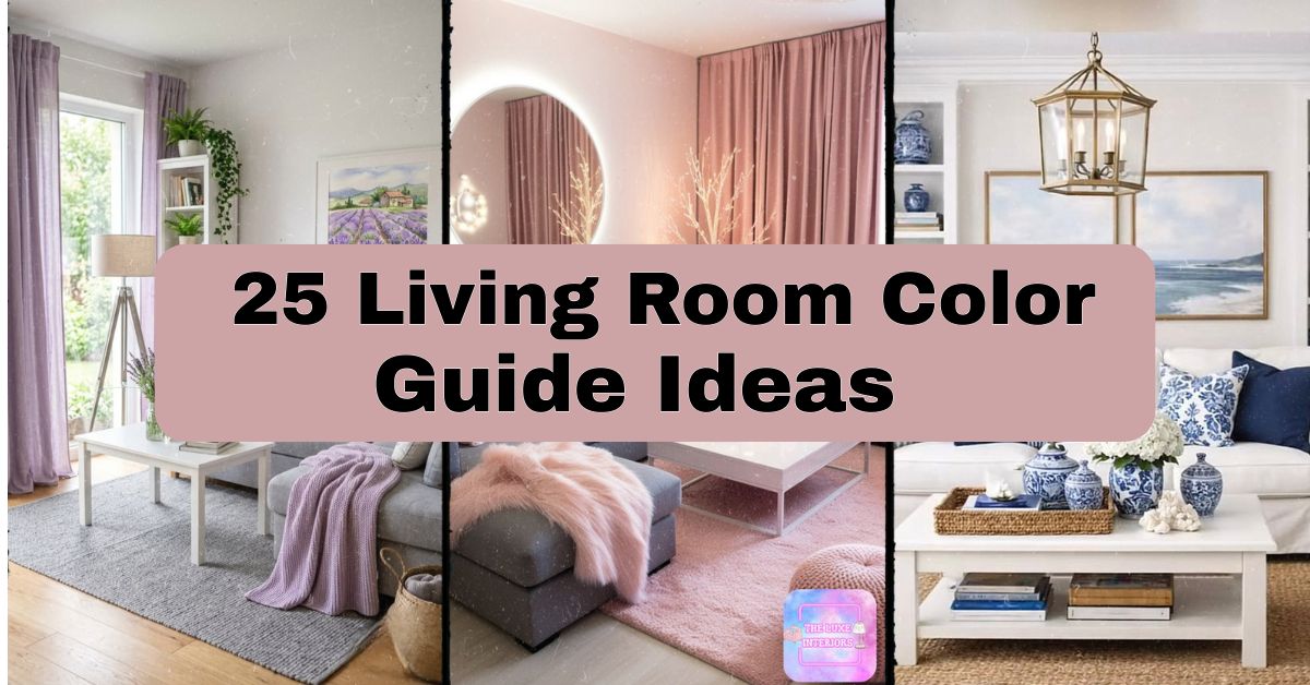
25 Living Room Color Guide Ideas That Actually Work
I have tested for many years how different paint samples look like in any lighting conditions through windows and helped my family and friends choose colors for painting which would not become the sources of remorse after six months. The following living room color guide is created on the basis of practical experience, and not from theoretical considerations which can be found on a mood board.
What is the best living room color guide? The best living room color guide suggests combination of neutral shades such as white, grey, beige colors together with accent color and warm metals in order to achieve harmony between tranquility and individuality.
Don’t go away yet. Let me show you 25 color combinations, couple tables, mistakes people usually make and some helpful recommendations.
Why Your Living Room Color Choice Matters More Than You Think
The important part is that your living room color scheme is not merely aesthetic but actually creates a mood right from the beginning before anyone even steps foot in it. If your living room is painted in deep navy tones, you will feel cozy and formal immediately upon entry. If your living room is painted in light yellow tones, you immediately feel lighter. Clients have changed a living room color from stark white to warm greige and instantly felt like their living room was “complete” with no changes made to any furniture whatsoever.
1. Warm Beige and Cream Base

It is true that beige does not have an appealing image, but a nice warm beige used together with white cream trim brings out warmth. The good thing about using the two colors together is that they bring out light without being too cold. You need to use some wood furniture, linen drapes, and a jute carpet to give the interior a feel of nature. You should also add a terracotta or rust-colored throw cushion to make it lively. It is perfect for traditional and farmhouses. A useful idea is to try out the beige during the day and evening light before painting. Let us now explore another combination.
2. Navy Blue and Gold Elegance

Navy walls can seem quite daunting, but they make some of the most attractive backgrounds for any furnishings and artwork. The key here is to match the dark color with gold touches such as gold-lensed lamps, gold frames of mirror pictures, and a mustard accent chair. Stick with a light neutral tone such as cream or oatmeal for your sofa in order not to end up with a cave-like living space. This combination fits well into modern or transitional homes. Tip: if you are not confident about painting all four walls in navy, go for one accent wall. And now let us move onto a softer color combination.
3. Sage Green Serenity

It’s easy to see why sage green is a popular choice. Its calming, earthy tones, along with its ability to match seamlessly with wood, rattan, and linen, make it an excellent color combination idea. Paint your walls with sage, pair them with cream-colored furniture, and complement the look with some wooden elements like a coffee table and picture frames. The concept fits perfectly for a boho and beachy theme in a living room setting. A quick trick would be to avoid using glossy paint because it tends to give off a fake feel. soft pairing.
4. Charcoal Grey and Blush Pink

The combination is surprisingly elegant. Charcoal grey walls or a sofa are used to anchor the room, whereas blush pink pillows, blankets, or wall art will make the entire space more soothing. Gold hardware will connect the two colors together. This is a great color scheme for modern or glam living rooms. A practical advice is not to use blush in abundance since it can be too sugary otherwise. Speaking about balance, we are going to the earthier side of things now.
5. Terracotta and Warm Earth Tones

Terracotta walls or furniture bring an instant Mediterranean warmth into any living room. Pair it with cream, tan, and deep brown accents for a grounded, earthy palette. Woven baskets, clay pottery, and wooden furniture complete the look. This scheme suits rustic, bohemian, and Southwestern-style homes beautifully. My tip: use terracotta as an accent color first (pillows, vases) before committing to full walls, since it’s a bold, saturated tone. Once you’ve got the earth tones down, let’s try something with sharper contrast.
6. Black and White Contrast

Classic doesn’t mean boring. Black and white living rooms create striking contrast, especially with graphic patterns like stripes or checkered rugs. Use white walls as your base, then bring in black furniture frames, lamps, or a statement piece of art. This works in modern, minimalist, or even art deco living rooms. Tip: add one warm wood tone (like a walnut coffee table) so the room doesn’t feel too stark or clinical. Contrast this bold look with something a little more dreamy next.
7. Soft Lavender and Grey

Lavender walls paired with grey furniture create a peaceful, almost ethereal living room. This combo works especially well in rooms with lots of natural light, since lavender can look muddy in darker spaces. Add silver or white accents to keep things airy. This style suits romantic, feminine, or Scandinavian-inspired homes. Practical tip: choose a lavender with more grey undertone than pink undertone for a more sophisticated, less “little girl’s bedroom” feel. Let’s shift gears toward something richer and more jewel-toned.
8. Emerald Green Jewel Tones

Emerald green is having a real moment, and for good reason. It’s luxurious without being loud. Pair emerald walls or a velvet sofa with brass accents and cream throw pillows. This works beautifully in art deco, glam, or eclectic living rooms. My tip: use emerald green sparingly if your room is small—one statement wall or a single piece of furniture is often enough. Too much can overwhelm a compact space. From jewel tones, let’s head toward the beach.
9. Coastal Blue and White

This combo practically breathes fresh air into a room. Soft blue walls, white furniture, and natural fiber rugs create that breezy coastal feel. Add navy or seafoam accents through pillows and throws for depth. This scheme is a natural fit for coastal, cottage, or nautical-themed homes. Tip: stick with matte or eggshell finishes on the blue walls to avoid a too-glossy, plastic-like look. Now let’s warm things up with a punchy accent color.
10. Mustard Yellow Accent

Mustard yellow adds warmth and personality without being as intense as bright yellow. Use it as an accent color through a sofa, chair, or curtains against a neutral grey or cream wall. This pairing works in mid-century modern or eclectic living rooms. Practical tip: balance mustard with cooler tones like navy or grey so it doesn’t feel like it’s fighting for attention. This bold accent naturally leads into a full monochrome approach.
11. Monochromatic Grey Scale

Sticking to different shades of grey—from charcoal to dove to silver—creates a sophisticated, cohesive living room. Layer textures like velvet, wool, and linen so the room doesn’t feel flat despite the limited color palette. This works especially well in modern and minimalist homes. Tip: use at least three different grey shades (light, medium, dark) to add depth. Otherwise, it can look washed out. Let’s contrast that cool palette with something warmer next.
12. Burgundy and Camel
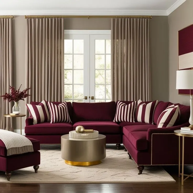
This combo feels like autumn all year round. Burgundy furniture or walls paired with camel-colored accents creates a rich, cozy atmosphere. Add brass or gold hardware to tie things together. This works beautifully in traditional or transitional living rooms. Practical tip: use burgundy on a single statement piece (like a velvet sofa) rather than the whole room, since it’s a heavy, dominant color. Next, let’s brighten things up with a fresh, playful pairing.
13. Teal and Coral
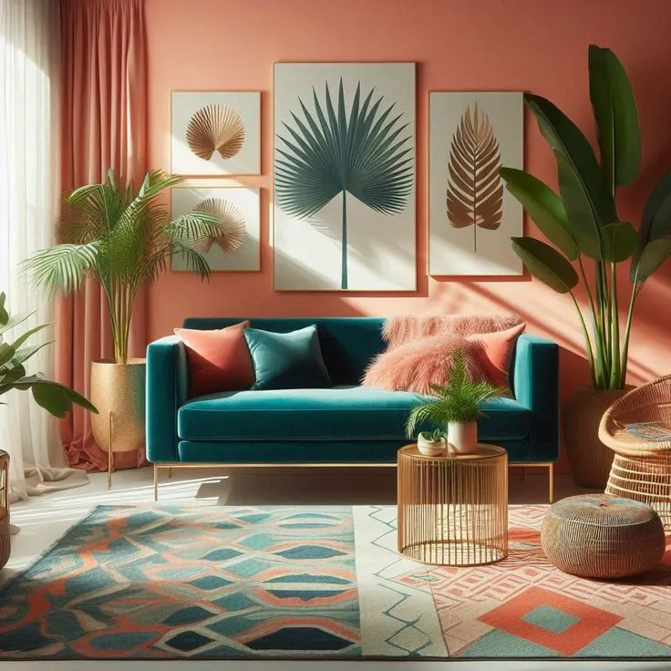
Teal and coral is a bold, energetic combo that works surprisingly well together. Use teal as your wall color and coral as accents through pillows, art, or a single accent chair. This scheme suits eclectic, bohemian, or coastal-modern homes. Tip: keep your larger furniture pieces neutral (cream or white sofa) so the teal and coral pop without clashing. Let’s tone things way down with a minimalist approach next.
14. All-White Minimalist

An all-white living room feels clean, spacious, and calm. The key is layering different textures—linen, wool, cotton—so the room doesn’t feel sterile. Add one natural wood element, like a coffee table, for warmth. This works perfectly in Scandinavian or minimalist homes. Practical tip: use varying shades of white (warm white, cream, off-white) rather than one flat white to add subtle depth. From minimalist white, let’s go rustic and earthy again.
15. Warm Terracotta and Olive

Olive green and terracotta together create a warm, earthy, almost desert-inspired palette. Pair with wooden furniture and woven textiles for texture. This works beautifully in bohemian or rustic living rooms. Tip: use olive as your dominant wall color and terracotta as accents through pillows or a rug. This keeps the room grounded without feeling too heavy. Let’s move into something softer and more romantic.
16. Dusty Rose and Sage

This unexpected pairing feels fresh and modern. Dusty rose walls or furniture combined with sage green accents create a soft, garden-inspired palette. This works well in romantic, cottage, or Scandinavian-inspired homes. Practical tip: add cream or white as a buffer color between the rose and sage so they don’t compete visually. Now let’s go bold with deep, moody greens.
17. Deep Forest Green and Brass

Forest green walls paired with brass fixtures create a moody, luxurious living room. Add cream or camel furniture to lighten things up. This works especially well in traditional or eclectic homes. Tip: use forest green in a room with good natural light, since darker greens can feel cave-like in dim spaces. Let’s soften things again with a peachy palette.
18. Soft Peach and Cream

Peach walls with cream furniture create a warm, welcoming glow, especially in living rooms with lots of natural light. Add gold accents for a touch of elegance. This works well in traditional or transitional homes. Practical tip: pair peach with grey undertones rather than pink undertones for a more grown-up, less nursery-like feel. Let’s head into cooler territory next.
19. Slate Blue and White

Slate blue is deeper and moodier than sky blue, giving it a more sophisticated edge. Pair with white trim and furniture for contrast. This works beautifully in coastal or modern farmhouse homes. Tip: use slate blue on a single accent wall if you’re nervous about the depth of color in a smaller room. From cool blue, let’s warm things back up with rustic browns.
20. Rustic Brown and Cream

Warm brown walls or furniture paired with cream accents create a cozy, cabin-like feel. Add plaid or checkered textiles for extra warmth. This works well in rustic, farmhouse, or traditional homes. Practical tip: balance heavy brown tones with plenty of cream or white to avoid the room feeling too dark or heavy. Let’s go glam again with blush and gold.
21. Blush and Gold Glam

Blush pink walls paired with gold accents create a luxurious, feminine living room. Add mirrored furniture or crystal accents for extra sparkle. This works well in glam or modern eclectic homes. Tip: keep large furniture pieces neutral so the blush and gold read as accents rather than overwhelming the whole space. Now let’s cool things down with icy tones.
22. Cool Grey and Ice Blue

This combo feels crisp and modern. Cool grey walls paired with ice blue accents create a fresh, airy living room. This works especially well in modern or Scandinavian homes. Practical tip: add warm wood tones to balance the coolness of the palette, otherwise the room can feel a bit sterile. Let’s warm things up one more time with chocolate and tan.
23. Warm Chocolate and Tan

Chocolate brown furniture paired with tan walls creates a warm, grounded living room. Add cream accents to lighten the palette. This works well in traditional or transitional homes. Tip: use lighter tan on walls and save the deep chocolate for furniture and accents, so the room doesn’t feel too dark overall. Let’s finish strong with two bright, cheerful combos.
24. Sunny Yellow and White

Yellow walls paired with white trim and furniture create a cheerful, energetic living room. This works especially well in cottage or coastal homes. Practical tip: choose a soft, buttery yellow rather than a bright lemon shade for a more livable, less overwhelming feel over time.
25. Classic Red and Neutral

Red is bold, but used correctly, it adds warmth and energy without overwhelming the space. Use red as an accent through pillows, art, or a single chair against a neutral grey or cream backdrop. This works well in traditional or eclectic homes. Tip: avoid using red on all four walls unless the room gets plenty of natural light, since it can feel heavy in dim spaces.
Living Room Color Guide: Mood and Best Room Type
| Color Combo | Mood Created | Best Suited Home Style | Recommended Room Lighting |
|---|---|---|---|
| Warm Beige & Cream | Cozy, Inviting | Farmhouse, Traditional | Warm, ample natural light |
| Navy & Gold | Dramatic, Elegant | Glam, Transitional | Layered lighting, lamps |
| Sage Green | Calm, Earthy | Bohemian, Coastal | Natural daylight |
| Charcoal & Blush | Sophisticated, Soft | Modern, Glam | Ambient lighting |
| Terracotta & Earth Tones | Warm, Grounded | Rustic, Southwestern | Warm-toned bulbs |
| Black & White | Bold, Clean | Modern, Minimalist | Bright, direct light |
| Emerald Green | Luxurious, Rich | Art Deco, Eclectic | Moderate to bright light |
| Coastal Blue & White | Breezy, Fresh | Coastal, Cottage | Natural light preferred |
| Mustard Yellow | Warm, Energetic | Mid-Century Modern | Warm ambient light |
| All-White | Calm, Spacious | Scandinavian, Minimalist | Bright, natural light |
Color Undertone Quick Reference
| Undertone Type | Examples | Best Paired With |
|---|---|---|
| Warm | Terracotta, Mustard, Peach | Wood tones, brass, cream |
| Cool | Slate Blue, Sage, Ice Blue | Silver, white, grey |
| Neutral | Beige, Greige, Tan | Both warm and cool accents |
Tips for Success
- Test paint colors on your actual walls, not just a swatch card, since lighting changes everything.
- Stick to the 60-30-10 rule: 60% dominant color, 30% secondary, 10% accent.
- Use matte or eggshell finishes on walls for a softer, more sophisticated look.
- Add texture through rugs, throws, and pillows to keep a limited palette from feeling flat.
- Bring in metallics (gold, brass, silver) to add polish to any color scheme.
Common Mistakes and How to Avoid Them
Mistake: Choosing a color without testing it in your room’s actual lighting.
Fix: Paint a large swatch and observe it morning, noon, and night before committing.
Mistake: Using too many bold colors at once.
Fix: Pick one dominant neutral and let a single bold color do the talking.
Mistake: Ignoring the flooring and existing furniture when choosing wall color.
Fix: Always coordinate new colors with what’s already staying in the room.
Mistake: Going too dark in a small or poorly lit room.
Fix: Save darker tones for accent walls or well-lit spaces.
Similar Variations You Can Try
- Swap gold accents for silver or chrome for a cooler, more modern feel.
- Try wallpaper instead of paint for added pattern within the same color family.
- Use color-blocking techniques, pairing two wall colors in one room for a modern twist.
- Rotate seasonal accents (pillows, throws) to refresh a color scheme without repainting.
I hope this living room color guide gave you a clearer picture of what actually works, not just what looks good on Pinterest. Pick a combo that fits your lifestyle, test it before committing, and don’t be afraid to mix a few of these ideas together. At the end of the day, the best living room color guide is the one that makes you actually want to walk into the room and stay awhile.